

Posted by Dr-Pete
Having built an online business during the dot-com boom and bust, I’ve always been a bit skeptical about the mobile revolution. Every year since the late 90s, we’ve heard that this would be “The Year” for mobile. In the past year, though, my skepticism has been challenged by a wide range of data, and I no longer believe that the mobile web is simply a miniature desktop. This post is an in-depth analysis of why I think online marketers need to start paying attention to mobile now.
Google’s “Mobile First” Shift
It’s no mystery that I follow Google’s actions pretty closely. When Google launched a significant redesign back in March, Jon Wiley – Lead Designer for Google Search – posted this on Google+:

For a long time, we’ve assumed that mobile would naturally follow desktop, and trends like the slow death of WML (Wireless Markup Language) seemed to support that assumption. In the past two years, though, Google has repeatedly designed and launched new features on mobile first, including the most recent ad format and the latest version of Google Maps.
So, it begs the question – what does Google know that the rest of us don’t?
Google’s Greatest Fear
In July of 2013, Google migrated AdWords advertisers to what it calls “enhanced” campaigns. Many in the industry viewed this as a euphemism for preventing advertisers from bidding separately on mobile and tablet vs. desktop. Google had been experiencing long-term CPC losses, and most analysts blamed those losses on advertisers’ unwillingness to pay the same rates for mobile/tablet clicks as they did for desktop.
Google has strongly resisted splitting out mobile vs. desktop performance, going as far as to tell the SEC that “…disclosing or quantifying the impact of only one factor, such as platform mix, could be misleading and confusing to investors.” This has nothing to do with usability or confusion – Google is afraid of mobile and its impact on their $60B bottom line, the vast majority of which depends on advertising. Mobile-first design is about survival, plain and simple.
Google’s Multi-Screen World
Back in 2012, Google released a fascinating study about the multi-screen world. It paints a complex picture of how we use multiple screens to navigate the web, and often perform activities across mobile, tablet, and desktop. Google ended that report with eight conclusions, and this was the final one:
What led them to this conclusion? A couple of data points give a very interesting view of the impact of mobile on search. First, Google reported (see slide #20) that a full 65% of searches begin on mobile phones. Second, they found – which seems obvious in retrospect – that we reach for the “screen” that’s closest (slide #34). So, if you see something on TV, hear about it on XM Radio in the car, or read about it in the doctor’s waiting room, you’re going to reach for your mobile phone.
More Mobile Trends (2014)
Recently, Mary Meeker’s closely-watched annual state of the internet report was released, and it contains a great deal of data about where mobile is headed. Smartphone adoption is climbing and tablet sales are skyrocketing, but I’d like to focus on one graph that sums up the trend pretty well (from slide #9):
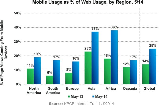
Globally, the percentage of page views coming from mobile devices has jumped substantially in the past year, and accounts for almost one-fifth of North American page views. Critics will argue that desktop usage has not substantially decreased, and that’s true, but the problem is this – as mobile gets to be a larger piece of the picture, we’re seeing less and less of that picture by excluding mobile data.
Look at it this way – let’s say we had a sample of 1M page views, and all of them came from desktop visitors. That would give us the pie on the left. Now, let’s say desktop holds steady at 1M page views, but mobile is now 19% of total views. This is what that reality would look like:
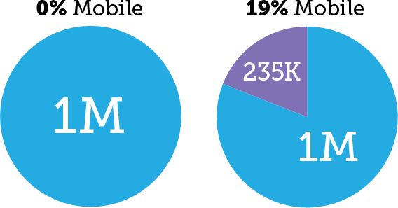
If we only look at those 1M page views, then it seems like nothing has changed, but the reality is that the desktop piece of the pie has shrunk. If we ignore mobile in this case, we’re missing out on 234,568 page views, and our picture is incomplete.
Why This Matters for Search
So what if someone starts a search on mobile – why should that matter to us as search marketers? The problem is simple: while Google desktop search design is being inspired by mobile design, the reality of a small screen means that mobile SERPs can look very different. Just as Google found with ad CTRs, this can lead to very different user behavior.
So, how different are mobile SERPs? I’d like to look at a few notable examples of desktop vs. mobile SERPs, starting from most similar to least similar. For all of these examples, the desktop SERP was captured on a Windows 7 PC using Chrome, at 1280×1024, and the mobile screen was captured on an iPhone 5S using Safari.
Here’s a fairly basic SERP (a search for “plumbers”) with ads and some local features. The desktop version is on the left, and the mobile version is on the right. I apologize for the reduced size, but I felt that a side-by-side version would be the most useful:
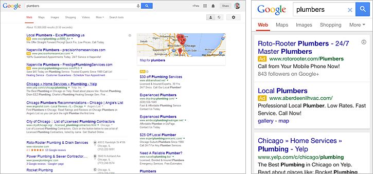
The impact of the smaller screen here is readily apparent – even though the desktop SERP shows eight full ads above the fold and the mobile SERP shows only two, the desktop screen still has room for three organic results, a map, and a couple of local pack results. Meanwhile, the one organic result that does pop up on the mobile screen has the advantage of being the only organic element on the “page”.
Unfortunately, we have very little data on relative CTR for either ads or organic results, and Google is tweaking both designs all of the time. I think the core point is that these user experiences, even for a relatively straightforward SERP, are clearly different.
Let’s look at another SERP (“army birthday”) where the major elements are similar, but the screen space creates a different experience. In this case, we get one of the new answer boxes:
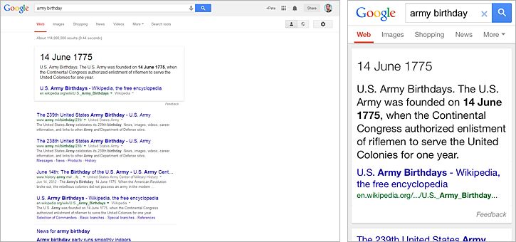
An answer box is disruptive on any screen, but on the mobile screen it occupies almost the entire SERP above the fold. Of course, scrolling is easier and more natural on mobile, so I don’t want to pretend this is a true apples-to-apples comparison, but if the answer meets the user’s needs, they’re unlikely to keep looking.
Let’s look at a standard Knowledge Graph box, in this case one for a local entity (“woodfield mall”). Here, while the styles of the Knowledge Graph boxes are similar, the SERPs are radically different:
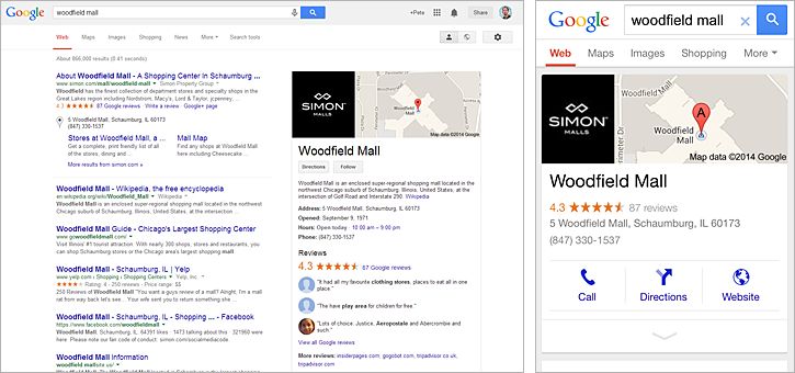
While the desktop SERP has a rich Knowledge Graph entry, we also see a substantial amount of organic real estate. On the mobile SERP, a condensed Knowledge Graph box dominates. That box also contains mobile-specific features, like click-to-call and directions, which could easily divert the searchers and keep them from scrolling down to organic results.
Finally, let’s consider a SERP where the presentation and structure are completely different between desktop and mobile. This is a search for “pizza” (from the Chicago suburbs, where I’m located), which triggers a local carousel:
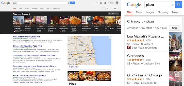
Carousels – whether they’re local, Knowledge Graph, or the newer song and episode lists – are a great example of mobile-first design. While the desktop carousel seems out of place in Google’s design history and requires awkward horizontal scrolling, the mobile carousel is built for a finger-swipe interface. What’s more, the horizontal swipe may derail vertical scrolling to some degree. So, again, a single element dominates the mobile SERP in this example.
The Mobile Feature Graph
These differences naturally lead to a follow-up question – do mobile SERPs just look different, or are they fundamentally showing different rankings and features than desktop SERPs? You may be familiar with the MozCast Feature Graph, which tracks the presence of specific SERP features (such as ads, verticals, and Knowledge Graph) across 10K searches. I decided to run the same analysis across mobile results and compare the two.
The table below shows the presence of features across both desktop and mobile SERPs. Data was recorded on June 5th. Both data sets were depersonalized and half of the queries (5K) were localized, to five different cities.
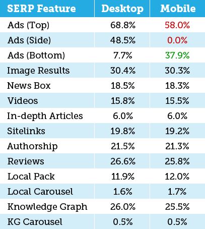
For the most part, SERP features were consistent across the two devices. While it’s very difficult to compare two sets of rankings (even when they differ only by a few hours), the similar number of sitelinks suggests a similar make-up of 10-result vs. 7-result SERPs. A cursory glance at the data suggests that page-1 rankings were not dramatically different.
The big feature difference (which is entirely driven by layout considerations) was in the presence and structure of AdWords blocks. Mobile SERPs only allow top and bottom ad blocks, since there’s no right-hand column. While bottom-of-page ads are the rarest block on desktop SERPs, they’re fairly common on mobile SERPs. The overall presence of ads in any single position was lower on mobile than desktop (at least for this data set). All of this has CTR implications, but we as an industry don’t have adequate data on that subject at present.
The local data is somewhat surprising – I would have predicted a noticeably higher presence of local pack results in mobile SERPs. Google has implied that as many as half of mobile searches have local intent, with desktop trailing substantially. Unfortunately, collecting comparable data required matching the local methodology across both sets of SERPs, so my methodology here is unreliable for determining local intent. This data only suggests that, if local intent is the same, local results will probably appear consistently across desktop and mobile.
The Google Glass Feint
Beyond our current smartphone and tablet world is the next generation of wearable technology, which promises even more constrained displays. Right now, we tend to think of Google Glass when we hear “wearables,” and it’s easy to dismiss Glass as an early-adopter fad. When we dismiss Glass, though, I think we’re missing a much bigger picture. Let’s say our timeline looks something like this, with us in the present and Glass in the future…
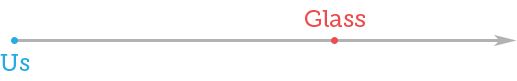
In other words, I think it was fair to say that Glass, whether you love or hate it, was clearly a future-looking move and is pushing our comfort zones. It was ahead of what we were ready for, and so Google pulled us ahead…

Let’s say we’re not quite halfway-ready for Glass. Stay with me – there’s a point to my crude line art. What about the wearables that aren’t quite as futuristic, including the wide array of fitness band options and the coming storm of smartwatches? Our perception now looks something like this…

Before Glass, we were just warming up to fitness bands, and smartwatches still sounded a bit too much like science fiction. After Glass, challenged with that more radical view of the future, fitness bands almost seem passé, and smartwatches are looking viable. I’m not sure if any of this was intentional on Google’s part, but I strongly believe that they’ve moved the market and pushed ahead our timeline for adopting wearables.
This isn’t just idle speculation paired with pseudo-scientific visuals (it is that, but it’s not just that) – Samsung sold half a million Galaxy Gear smartwatches in Q1 of 2014. Google has recently announced Android Wear, and the first devices built on it have hit the market. More Android-based devices are likely to explode onto the market in the second half of 2014. Rumors of an Apple smartwatch are probably only months away from becoming reality.
I expect solid smartwatch adoption over the next 3-5 years, and with it a new form of browsing and a new style of SERPs. If the smartphone is our closest device and first stop today, the smartwatch will become the next first stop. Put simply, it’s easier to look at our wrists than reach for our pockets. The natural interplay of smartwatches and smartphones (Android Wear already connects smartwatches to Android-powered phones, as does Google Glass) will make the mobile scene even more rich and complex.
What It Means for You
My goal is to put the data out there as matter-of-factly as possible, but I personally believe that the long-awaited mobile disruption is upon us. Google is designing a SERP that’s not only “mobile first”, but can be broken into fragments (like answer boxes and Google Now “cards”) that can be mixed-and-matched across any device or screen-size. Search volume across non-desktop devices will increase, and mobile in all its forms may become the first stop for the majority of consumer searches.
For now, the most important thing we can do is be aware. I’ve always encouraged browsing your “money” terms – what does your URL really look like on a SERP, and how does the feature set impact it? I’d strongly encourage the same for mobile – open a phone browser and really try to see what the consumer is experiencing. If your business is primarily local or an impulse buy driven by TV and other advertising, the time to consider mobile is already behind you. For the rest of us, the mobile future is unfolding now.
Sign up for The Moz Top 10, a semimonthly mailer updating you on the top ten hottest pieces of SEO news, tips, and rad links uncovered by the Moz team. Think of it as your exclusive digest of stuff you don’t have time to hunt down but want to read!